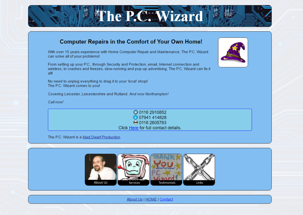
As you may have noticed, the main site, thecrystalwizard.co.uk, has undergone a redesign.
This is part of the recent re-acquisition of our Mother Site, maddwarf.co.uk. Mad Dwarf Productions (MDP) was the original “umbrella organisation” for all of my projects, but due to circumstances beyond my control, the website fell into disrepair. My recent projects sprang up without the guiding light of MDP to keep them coherent, and the designs all went in their own directions.
Now that MDP is back, I am slowly bringing all of the wayward children back into the fold. TechnoPrisoners was designed alongside MDP, and actually sits as sub-site, befitting its station as the first incarnation of MDP-Online. Crystal Wizard has now been brought in line, and the other sites will soon follow.
While I do not profess to be a Master Web-Designer, I have put no small effort into both the technical and aesthetic sides of this design, and I hope it works for you!
The colour schemes have been colour-matched, using a different scheme for each site, to represent their unique flavours, while relying on a common template. The base concept of using labelled Image Links aims to make the site both visually attractive and easy to use, giving quick recognition to each area. Rounded corners softens the look, giving a slightly more informal feel.
Behind the scenes, files have been tidied, renamed and optimised, stripping away unused clutter. The code for the pages has been almost entirely rewritten, incorporating labelled areas (DIV and SECTION tags), and many design elements moved to separate Style Sheets, for ease of maintenance.
I have tried to follow Best Practices for accessibility, incorporating ALT tags to describe images, and making the pages compatible with screen-reading technology for text-to-speech systems.
The Dark Art of SEO (Search-Engine Optimisation) has featured, but as this Alchemy involves tainting ones soul with the ever-vain search for Impressions, Clicks and Likes, I have kept it to the minimum required.
Analytics are run through Google’s offerings, tracking page hits, entry and exit pages, user flow and interactions. This anonymised data is useful for gauging interest, and locating faults, and can be used to suggest area that can use more attention.
Instead of creating a separate Style for mobile devices, the base theme has been written to automatically adjust, allowing the device to display content appropriately. An important design consideration, as people have a wide range of technologies to view the Web on, with a variety of screen-sizes available.
I hope this will lead to a comfortable, coherent experience for my readers, and welcome any feedback regarding the new design!
